IFIC renews its corporate image on its 75th anniversary
To mark its 75th anniversary and the award of its second 'Severo Ochoa Centre of Excellence' distinction, the Institute of Corpuscular Physics (IFIC), a joint centre of the CSIC and the University of Valencia, is launching a new corporate image. This accreditation recognises the quality and level of excellence of the centre's research. IFIC has previously received this distinction for the 2015–2019 period, and this is the second time it has obtained it. These milestones highlight the institute's scientific relevance and explain the decision to update its brand. The visual refresh aims to reflect a modern, dynamic IFIC that is connected to society, in line with the innovative nature of its research.
New corporate identity
A corporate image encompasses how an institution is visually perceived, including the beliefs and associations (such as ideas, values and attributes) that people form when they see it. With this new visual identity, IFIC aims to reinforce its values. The centre's logo, colour palette and typography have been redesigned to create a contemporary, cohesive and distinctive style. A brand manual has also been produced to guide the correct use of the new logo and graphic elements across all institutional platforms, such as the website, outreach materials and presentations. This will ensure consistency in every public appearance. To celebrate the anniversary, a special commemorative version has been created alongside the standard version.
Geometric logo
The new logo incorporates lines and basic geometric shapes to symbolise scientific progress from simple elements. According to the designers, the logo features figures of increasing complexity to symbolise the evolution of knowledge, representing the progression from intricate shapes to the most fundamental unit in scientific understanding: the point. Within this metaphor, we are currently at the 'triangle' stage. A grid is then created to structure the logo’s design.
Symbol of connection
The current logo splits the acronym 'IFIC' into two parts, creating a visual representation of the connection between science and society. This duality reinforces the institute's mission of conducting excellent research and projecting it to the public. Furthermore, the distinctive shape of the 'I' represents various aspects of nuclear and high-energy physics, such as the collision of two particle beams, a collimator in an accelerator, two matter jets in astroparticles or the spontaneous symmetry breaking of the Standard Model through which particles acquire mass — and which gives the logo its character.
Dynamic colour palette
Vibrant, contrasting colours have been selected to convey dynamism and innovation. These tones energise the logo, setting it apart from the previous version and aligning it with the visual identity of its parent institutions, the CSIC and the University of Valencia, while giving it a friendlier look.
Corporate identity manual
A brand manual has been published to set out the new identity guidelines. It includes variants of the logo (horizontal, vertical and monochrome), colour rules, institutional fonts, and examples of applications in stationery and digital media. The aim is to ensure that all IFIC research groups, departments and events apply the new image consistently.
Corporate video
The centre is also working on a modern version of its corporate video, showcasing all its activities. This will be available soon.
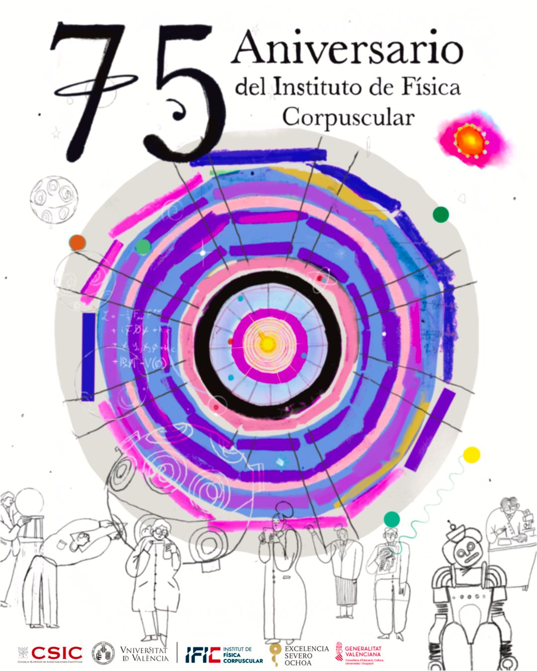
75th Anniversary Poster
To celebrate the anniversary, visual artist Víctor Visa has created a commemorative poster encapsulating the scientific spirit of IFIC. The central motif depicts a primordial explosion from which particles and stars emerge, alluding to the expansion of the universe. Superimposed on this background is a colourful reinterpretation of the ATLAS detector diagram from the LHC, in which IFIC participates. This diagram is composed of concentric circles. As the artist explains, this image symbolises 'working on the smallest to reach the greatest': the nested circles suggest that by studying elementary particles — the tiniest building blocks — we expand our understanding of the entire cosmos.
The design also incorporates other details representing the full scope of the institute's work. At the centre is a visualisation of a primordial explosion from which particles, stars and other elements emerge, evoking the expansion of the universe. General physics elements can also be identified, such as the representation of the absolute neutrino mass from supernova explosions.
At the bottom of the image are minimalist human figures. These silhouettes provide a sense of scale, highlighting the immense size of the detector and offering a historical perspective. Each figure carries elements from different eras in the form of clothing or objects, portraying the passage of time across the institute’s 75 years and paying tribute to the generations of IFIC scientists and the evolution of research in Valencia.
Overall, the new corporate image and anniversary poster present IFIC as a forward-looking centre with a renewed brand that conveys its scientific values to society. The institution hopes that this fresh, symbolic visual identity will clearly communicate its commitment to research excellence and public engagement.